3 Flawless Layouts and 5 Real-Life Studio Solutions
Wondering how to arrange furniture in your small apartment? Get 3 fail-proof layouts for narrow living rooms and 5 genius plans for studio apartments.
The Ultimate Guide to Small-Space Living: 3 Flawless Layouts for Narrow Rooms and 5 Real-Life Studio Solutions
Introduction: The American Small-Space Challenge
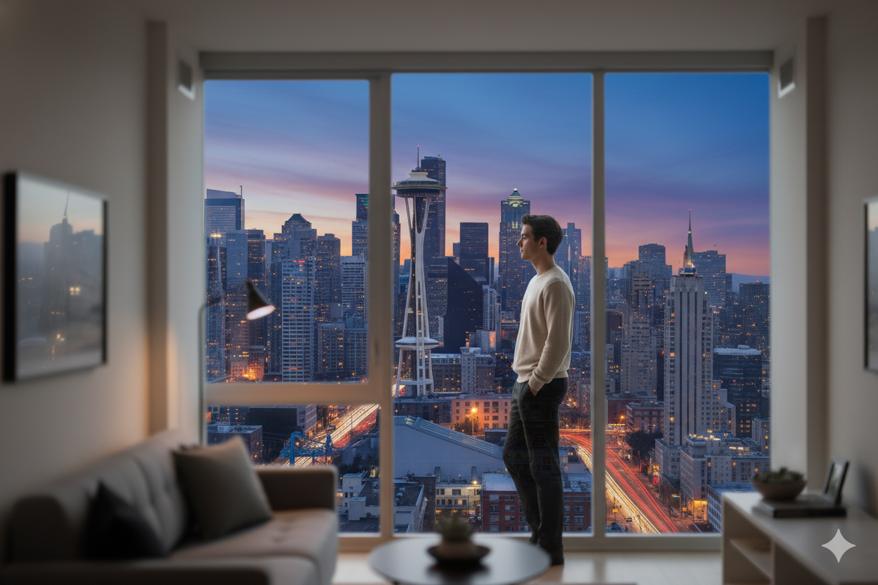
Living in a small space is no longer a temporary compromise; it is a conscious lifestyle choice for millions of Americans. This trend is not a bug but a feature of modern, desirable urban life. The data clearly illustrates this cultural shift: the average apartment in a city like Seattle is just 649 square feet, while renters in dense urban cores like Manhattan and Chicago navigate spaces averaging around 733 square feet. This move toward more compact living is propelled by powerful social and economic drivers, including a desire for sustainability, a preference for the economic and cultural access of urban centers, and a demographic shift, with Millennials and younger generations marrying later and having smaller families.
The challenge, therefore, is not the square footage itself. The true challenge is the psychological toll of a poorly designed space, which can lead to feelings of claustrophobia, stress, and inefficiency. This reality has reframed the contemporary "American Dream": it is no longer about maximum space but about maximum design. When urbanites pay a premium for a 700-square-foot apartment, the design cannot be an afterthought; it must be flawless. This analysis is not a budget-fixing guide but a lifestyle-optimization manual. It provides expert-level strategies to solve the two most formidable "boss levels" of small-space design: the long, narrow "railroad" room and the all-in-one studio apartment.
Part 1: Solving the Narrow Living Room: 3 Flawless Layouts
This section addresses the unique spatial problem of long, narrow living rooms, which are architectural hallmarks of historic city dwellings like New York's "railroad apartments," Philadelphia row homes, and subdivided brownstones.
1.1 The Core Problem: The "Bowling Alley Effect"
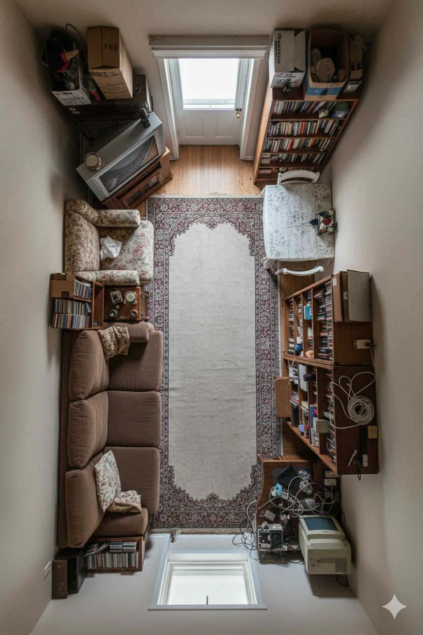
The primary challenge in a long, narrow room is the "bowling alley effect". This is the uncomfortable, "tunnel vision" sensation where the room feels less like a cozy living area and more like a corridor or hallway. This effect is almost always self-inflicted, caused by the most common and intuitive design mistake: pushing all the furniture—the sofa, media console, and bookshelves—back against the two long walls. While this is done in a misguided attempt to maximize the "open" center, it only succeeds in creating an awkward "path down the center" and accentuating the room's most challenging proportions.
The expert solution requires a paradigm shift: usable space is more valuable than empty space. A defined, functional, and well-proportioned zone feels larger and more luxurious than a long, empty hallway. The following three layouts are all counter-intuitive strategies designed to "divide and conquer" this challenging shape.
1.2 Layout 1: The "Zoned" Approach (Divide & Conquer)
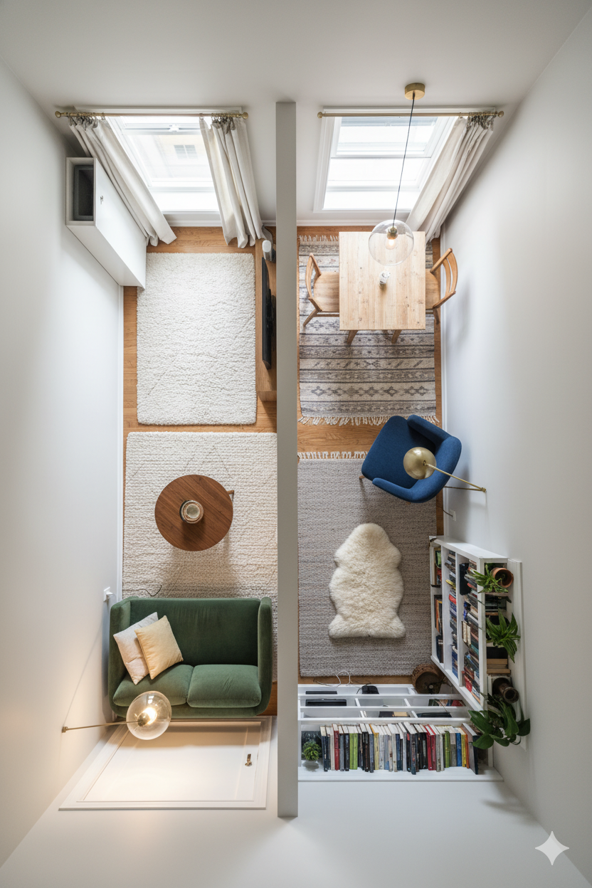
This is the most flexible and popular solution. The strategy is to reject the idea of one long room and instead break the space into multiple, distinct functional "zones". A single 20-foot-long room, for example, can comfortably become a social/TV zone, a dining nook, and a small home-office corner.
This is achieved using a designer's "zoning toolkit":
-
Anchor with Rugs: Rugs are the most powerful tool for establishing "visual boundaries". A distinct area rug should be used to "anchor" the furniture in each zone. Using different shapes, such as a large rectangular rug for the sofa area and a smaller round rug for a reading nook, can be particularly effective in breaking up the linear feel.
-
Create "Soft" Partitions: Furniture itself can create a "room divider" without blocking light or flow. The back of a "floating" sofa , a tall, open-back bookshelf like an IKEA KALLAX , or a console table placed neatly behind a loveseat all send a strong visual cue that one zone has ended and another has begun.
-
Define with Light & Color: Strategic lighting and color can also delineate space. Hanging a statement pendant light over a small bistro table instantly "claims" that area as the dining zone. Similarly, "color blocking"—painting a small section of a wall a different, complementary color—can visually define a work nook.
A critical component of this layout is cohesion. While the zones are functionally distinct, they must be aesthetically unified to prevent the room from feeling chaotic. This is achieved by maintaining a consistent underlying theme, such as a shared color palette, the same wood tones across furniture, or consistent metallic finishes on lamps and hardware.
1.3 Layout 2: The "Floating" Conversation Pit
This is the most universally designer-endorsed and visually dramatic solution. It requires fighting the instinct to hoard floor space and instead "float" the main furniture by pulling it away from the long walls.
Instead of pushing the sofa against the wall, it is pulled toward the center of the room. Armchairs are then grouped opposite or adjacent to it, clustered around a central anchor like a coffee table or a large rug. This action accomplishes two things simultaneously. First, it creates a cozier, more intimate, and more functional conversation area. Second, it establishes clear and intentional pathways behind the furniture, which paradoxically improves traffic flow and makes the room feel more organized.
This layout is the single most effective strategy to break the "bowling alley" effect. Psychologically, it is a power move: instead of letting the room's awkward architecture dictate the layout, the "floating" arrangement imposes a new, well-proportioned "room" inside the old one. The furniture, not the walls, defines the boundaries of the living space. This method does, however, have one caveat: it requires a certain minimum width. In an extremely narrow room (e.g., under 8 or 9 feet wide), floating furniture can indeed make the space feel more cramped and obstructive.
1.4 Layout 3: The "Clear Path" Layout
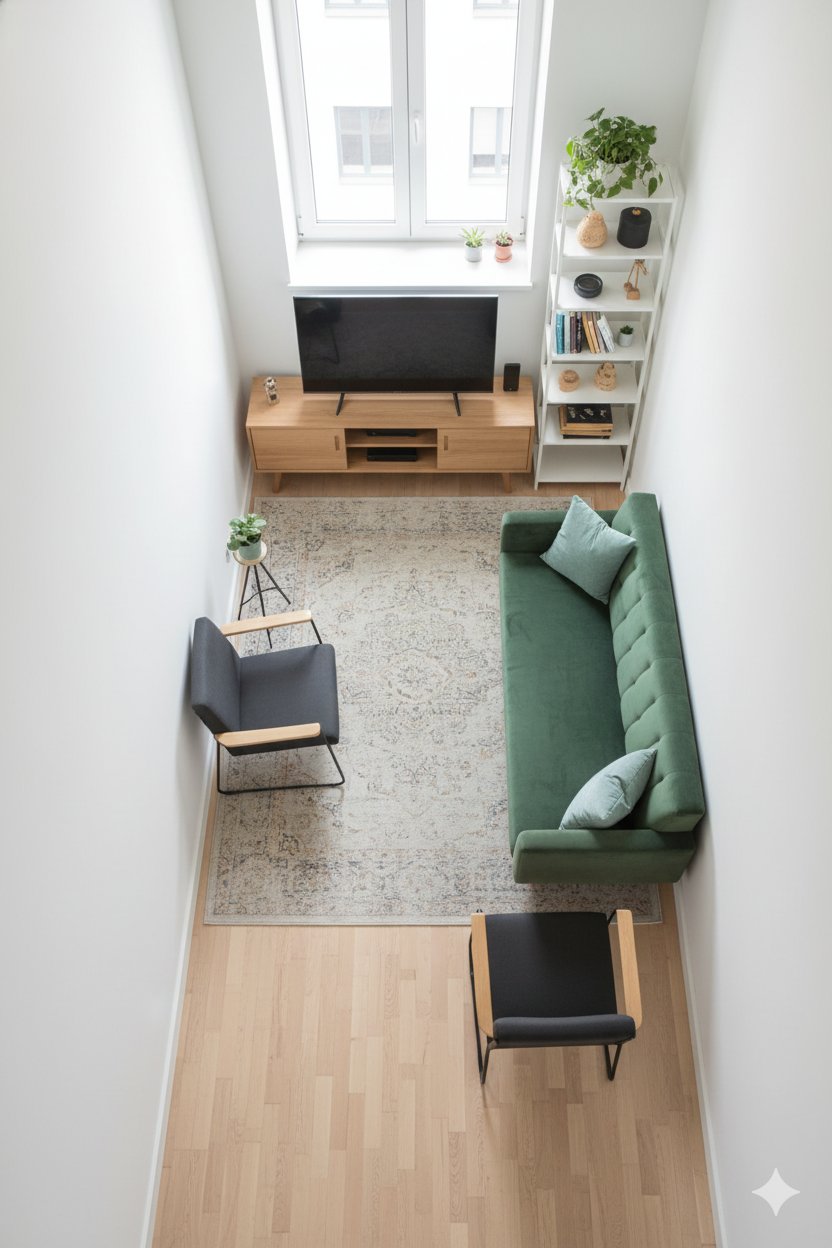
This layout is a highly functional solution that prioritizes efficient traffic flow above all else. It works by functionally dividing the room into two distinct longitudinal lanes: one for "living" and one for "walking".
To execute this, all main furniture—sofa, media console, chairs, and shelving—is consolidated onto one side of the room. This leaves a clear, unobstructed "runway" or passageway on the other side, allowing people to move from one end of the apartment to the other without interrupting the living zone. For this pathway to feel comfortable and intentional, it must be at least 3 feet (36 inches) wide.
A professional tip to enhance this layout is to place some furniture perpendicular to the long wall. An L-shaped sectional or a sofa with a chaise that juts into the room helps to "stop the eye" and prevents it from "running" down the entire length of the space, further mitigating the tunnel effect. This approach succeeds by embracing, rather than fighting, the room's "hallway" nature. By strategically ceding 3 feet of width to become a pure hallway, it allows the remaining width (which may be 7-8 feet) to feel like a pure, proportional, and intentional living room.
Part 2: How to Organize Your Studio Apartment: 5 Real-Life Examples
Moving from a single-room layout to a single-room home, the studio apartment presents a more complex organizational challenge. A studio, by definition, must combine all facets of modern life—sleeping, eating, living, and, increasingly, working—into one compact space.
The number one psychological hurdle for studio dwellers is the functional and mental bleed between these activities, best exemplified by the dreaded "bed in the kitchen" or "bed in the living room" feeling. This compromises privacy and makes it difficult to mentally transition from one activity to the next. Analysis of real-life studio solutions shows that residents will often prioritize privacy for the sleeping area even if it means a slightly smaller living area. This reveals the true hierarchy of needs for studio living: Psychological Separation > Perceived Size. The following five real-life examples are all successful strategies for achieving this critical mental separation.
2.1 Real-Life Example 1: The "Transformer" (The Murphy Bed Solution)
-
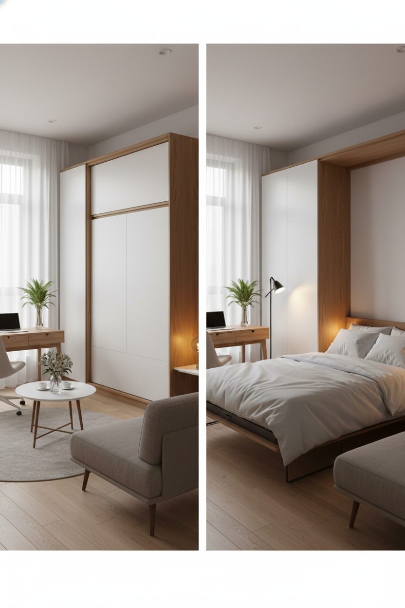
The Profile: This solution is ideal for a 400-square-foot studio in a high-density city, particularly for a resident who works remotely.
-
The "How-To": This layout is about dual-function, not co-existence. It does not try to fit a bed and an office in the same room; it creates two different rooms that exist at different times of the day. By day, the space is a fully functional home office with a large desk and a comfortable sofa. By night, a Murphy bed (wall bed) folds down, transforming the entire room into a spacious, cozy bedroom.
-
Key Pieces: Modern Murphy beds are sophisticated pieces of engineering. They can be integrated with a sofa, where the sofa itself tucks under the bed as it descends , or integrated with a desk, which remains level and full of items as it pivots under the bed frame. This is often paired with other "transformer" furniture, like a coffee table that converts into a dining table.
-
The Logic: This is a binary solution that maximizes floor space. It is the ultimate layout for the person who values maximum utility and refuses to compromise. They get a real bed and a real sofa, just not at the same time.
2.2 Real-Life Example 2: The "Divider" (The IKEA KALLAX Solution)
-
The Profile: This is the classic, real-world solution for a 450-square-foot studio, often seen in a first apartment where the resident needs to separate the bed from the living room on a practical budget.
-
The "How-To": The resident places a tall, open-back shelving unit—most ubiquitously the IKEA KALLAX —perpendicular to the wall, creating a physical partition between the sleeping area and the sofa area.
-
Why It's Genius: This "real life Tetris" move is brilliant because it solves three problems at once:
-
It creates the necessary visual separation for privacy.
-
Its open cubbies allow natural light to pass through, preventing the space from feeling dark and boxed-in.
-
It provides crucial, double-sided storage for books, records, and decor.
-
-
The Logic: This is the power of the "conceptual barrier". The goal is not to build a wall, which would shrink the space and block light. The goal is to suggest a wall. The KALLAX is the perfect physical manifestation of this concept.
2.3 Real-Life Example 3: The "Vertical" (The Loft Bed Solution)
-
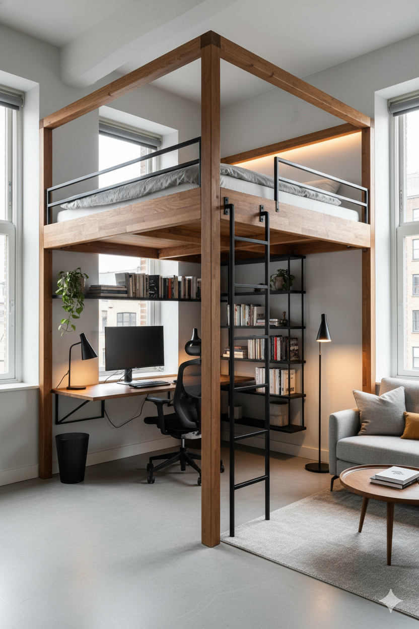
The Profile: This layout is designed for "micro apartments" or smaller studios (e.g., 330 square feet ) that are blessed with high ceilings. It is a favorite of students and creative professionals.
-
The "How-To": The bed is "elevated" on a loft bed, taking the entire sleep function completely off the main floor plan.
-
The "Bonus" Space: This single move is transformative. The entire footprint underneath the bed is reclaimed. This newly created "bonus" space becomes a "designated workspace" , a complete "home office setup" with a desk and shelving , or what some call a "cloffice" (a closet-office hybrid).
-
Key Pieces: While often associated with dorms, sturdy adult-sized loft beds are available in full and queen sizes. IKEA's systems, like the SMÅSTAD or VITVAL, are popular for integrating desks and storage directly.
-
The Logic: While other layouts focus on horizontal zoning, this is vertical zoning. It "merge[s] sleeping and working areas within a single footprint". This is arguably the most efficient layout, as it stacks the two least-compatible functions (sleep and work) on top of each other, completely isolating them without using a single extra square inch of floor.
2.4 Real-Life Example 4: The "Virtual" (The Sofa-Back Solution)
-
The Profile: This is a sophisticated layout for a "bright, minimal and ultra functional" studio, such as a 538-square-foot loft, often favored by architects or designers who value openness and light above all.
-
The "How-To": This layout uses no physical dividers. Instead, the space is "virtually divided" using subtle but powerful visual cues.
-
Furniture Placement: The back of the sofa is "floated" in the middle of the room, facing away from the bed, creating a strong mental separation.
-
The Desk-as-Divider: In one real-life example, a desk is placed at the foot of the bed. The bed "softly leans against the desk," allowing the desk to function as a low-profile, functional headboard and a divider for the workspace.
-
The Accent Wall: In another tour, removable wallpaper was used only in the bed alcove. This visual "claiming" of the space makes it feel like a separate, intentional room.
-
-
The Logic: This is the most psychologically advanced layout. The desk-as-divider and wallpaper-as-zone are not barriers; they are cues. This layout is for someone who prizes visual openness and light over physical privacy.
2.5 Real-Life Example 5: The "Minimalist" (The Hidden-Storage Solution)
-
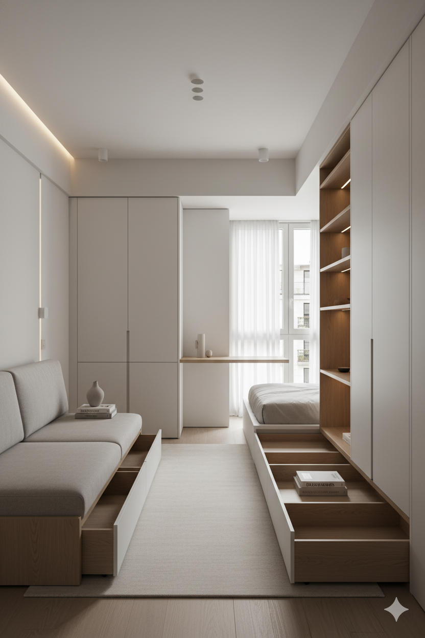
The Profile: This is the "minimal, chic retreat" , a 450-square-foot NYC studio where the primary goal is to feel "homey, chic, and glamorous".
-
The "How-To": This layout's success is 100% dependent on an obsessive, "everything-in-its-place" storage strategy. The "layout" is defined by what you do not see.
-
The Storage System:
-
Multi-Functional Furniture: Every large piece works double-duty. This includes a storage ottoman , a storage headboard for books and electronics , and a sofa or bed with built-in drawers , like the "triple threat" IKEA HEMNES daybed that acts as a sofa, bed, and dresser.
-
"Hidden" Storage: This involves creating storage in unseen places, such as using risers to elevate a bed frame for clear, stackable bins underneath , or even hiding items behind curtains or a large, leaning mirror.
-
Vertical Storage: "Utilize vertical space" is the mantra. This means installing tall cabinets that go to the ceiling , wall-mounted shelves , and over-the-door organizers to get clutter off the floor.
-
-
The Logic: This layout is enabled by the design principle of "negative space". A room feels luxurious, chic, and calm when it has "room to breathe". In a studio, this is only possible if the stuff of life is ruthlessly organized and hidden. A commitment to hidden, multi-functional storage enables a layout based on negative space, which results in the desired "chic, minimalist" feeling.
Part 3: The Expert Toolkit: Pro-Tricks for Any Small Space
The layouts and examples above are all empowered by a set of universal design principles. These are the professional tricks that work in any small space.
3.1 The Power of Layered Lighting
The most common mistake in a small apartment is relying on a single, harsh overhead light. This flattens the space, makes it feel dull, and actually emphasizes its smallness. Professional design requires layering three distinct types of light to add depth, warmth, and function.
-
Ambient Light: This is the general "foundation" glow of the room. It provides uniform illumination and sets the overall mood. This comes from ceiling fixtures, large floor lamps, or wall sconces.
-
Task Light: This is bright, focused, direct illumination for specific activities. It prevents eyestrain and creates functional zones. Examples include a desk lamp, under-cabinet kitchen lights, or a reading sconce by the bed.
-
Accent Light: This is soft, dramatic light used to highlight features and create visual interest. It can be a picture light over artwork, track lighting aimed at a bookshelf, or hidden LED tape lighting.
Layered lighting is, in itself, another form of zoning. By placing a task lamp on a desk, a warm floor lamp in a reading corner, and a pendant light over a table, you have successfully created three distinct "zones" using only light.
3.2 Color & Mirror Magic: The Psychology of Space
Color and reflective surfaces are powerful tools for manipulating the perception of space.
-
The "Standard" Advice: Light, airy, and cool colors—such as whites, soft grays, and pale blues—are classic choices for small spaces. They reflect light and "visually recede," making a room feel bigger, brighter, and more open.
-
The "Illusion" Trick: Large mirrors with minimalist frames are a "cure-all" for small rooms. A strategically placed mirror can "double perceived space" and act like an additional window, reflecting both light and views from outside, which adds depth.
-
The "Expert" Advice: Go Dark. A counter-intuitive but powerful professional strategy is to use bold, dark colors like charcoal, navy, or deep green. This works through "color drenching": painting the walls, the trim, and even the ceiling the same dark hue. This technique "minimizes the visual boundaries" and "blurs the corners," making the edges of the room recede and creating an illusion of depth that is cozy, sophisticated, and dramatic.
-
A Specific Trick for Narrow Rooms: To visually "correct" a narrow room's proportions, paint the shorter end walls a darker color to make them "advance," and paint the long walls a lighter color to make them "recede".
This presents two contradictory strategies: go light or go dark. The choice depends on the goal. As one resident in a small-space tour noted, "I think people who live in small spaces should try to make their apartments look/feel interesting rather than larger". Light colors aim to feel airier. Dark colors aim to feel intentional, dramatic, and cozy.
3.3 Where to Shop: The Small-Space Shopping List
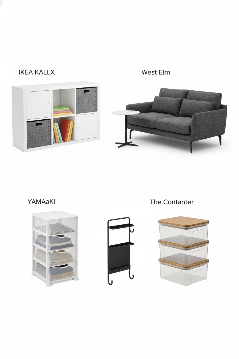
The savvy American shopper does not furnish their home from a single store; they curate a high-low mix.
-
For Smart Bones & Hacks (IKEA): This is the "gold standard" for affordable, "minimalist design". This is the destination for foundational pieces that solve specific spatial problems: the KALLAX shelf-divider , the HEMNES daybed (a "triple threat" sofa/bed/storage) , and basic vertical shelving.
-
For the "Investment" Piece (West Elm & CB2): This is where to allocate budget for the statement piece that will be seen and used daily, like a sofa or bed frame. West Elm is known for its "Mid-century modern meets small-space savvy" aesthetic, with many pieces "designed for city living". CB2 caters to the "urban minimalist" with an edgier, more modern-design-forward aesthetic.
-
For "Making it All Fit" (The Container Store): This is the "secret weapon" that makes minimalist living possible. This is the source for the invisible infrastructure: the drawer dividers , the clear under-bed bins , and the sleek document boxes that enable the "Minimalist" (Example 5) and "Chic" aesthetics.
This "high-low" curation —buying the functional "bones" at IKEA, the "statement" piece at West Elm, and the "infrastructure" at The Container Store—is the authentic insider's approach to a well-designed small space.
Conclusion: Your Space is Not a Problem, It's a Project
The challenge of a narrow room or a studio apartment is often seen as a limitation. This analysis reframes it as a design prompt. The solutions demonstrate that the core principles of good design are universal: Zoning , Floating furniture , embracing Multi-functionality , utilizing Verticality , and mastering Illusion with light and color.
Ultimately, the goal is not just to "make a small room look big." The goal is to create a space that is functional, intentional, and a true reflection of your style. In the modern American city, that is the ultimate luxury.
More from Studio & Small Apartment
Layout, decor, and life in studio and small apartments.
How Do You Decorate a Studio Apartment?
Wondering how to furnish your studio apartment without it feeling cramped? This guide answers your questions with smart ideas for zoning, furniture, and deco...

How to Decorate a Studio Apartment: An Expert's Guide
8 min read
How Do You Decorate a Studio Apartment?
10 min read
The Art of Studio Living: Your Complete Guide
10 min read
How to Layout a Small Apartment?
25 min read
How Do You Decorate a One-Bedroom Apartment?
18 min read
How to Light an Apartment with No Overhead Lighting (Room-by-Room Guide)
23 min read
Tags

Written by Joesp H.
Interior Design & Small Space Living Specialist
Former marketing manager turned full-time home optimizer. After living in 7 homes ranging from 450 to 2,000 sq ft, I started CleverSpaceSolutions to help people create organized, functional spaces on real budgets.
Other Articles
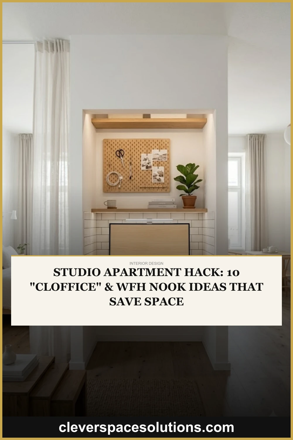
Studio Apartment Hack: 10 "Cloffice" & WFH Nook Ideas That Save Space
Need a home office in your studio apartment? Discover 10 clever ways to create a WFH nook, including amazing "cloffice" (closet office) hacks.
How to Decorate a Small Home: A Room-by-Room Guide
Wondering how to make your small home feel bigger and more stylish? Our complete room-by-room guide answers your questions with practical decor tips for the ...

How to Layout a Small Apartment?
Need small apartment layout ideas? Our guide answers how to arrange furniture in narrow living rooms (3 plans) & studio apartments (5 plans) to maximize space.