How to Layout a Small Apartment?
Need small apartment layout ideas? Our guide answers how to arrange furniture in narrow living rooms (3 plans) & studio apartments (5 plans) to maximize space.
The Ultimate Small-Space Playbook: 3 Flawless Layouts for Your Narrow Living Room & 5 Genius Plans for Your Studio Apartment
Let’s get one thing straight: having a small apartment isn’t a consolation prize. It’s a creative challenge, a design puzzle, and an opportunity to live a more intentional, curated life. Forget the word “cramped.” We’re banishing it from our vocabulary. From now on, your space is “cozy,” “clever,” and a perfect canvas for your personality. In a world that often equates bigger with better, you’re about to discover that a well-designed small home can feel more luxurious, functional, and deeply personal than a sprawling, soulless mansion. You don’t have a problem; you have a playbook waiting to be written.
And that’s exactly what this is. Consider this your definitive guide to conquering the two most notorious small-space villains: the long, narrow “bowling alley” living room and the one-room-fits-all studio apartment. We’re going to arm you with the universal truths of small-space design—the optical illusions and psychological tricks that designers swear by. Then, we’ll hand you three flawless, step-by-step blueprints for arranging that tricky narrow living room. Finally, we’ll take you on a tour of five genius, real-life-inspired layouts for your studio, proving that you can have a distinct bedroom, living room, dining area, and even a home office, all within four walls.
Get ready to maximize every square foot without sacrificing an ounce of style. The home you love starts right here.
Part I: The Small-Space Survival Guide: Universal Truths for Tricking the Eye
Before we start rearranging furniture, we need to master the fundamental principles that make any small space feel bigger, brighter, and infinitely more brilliant. These are the foundational rules that professional designers use to bend perception and create the illusion of space where none seems to exist. Master these, and you’ll have the tools to solve any design dilemma your apartment throws at you.
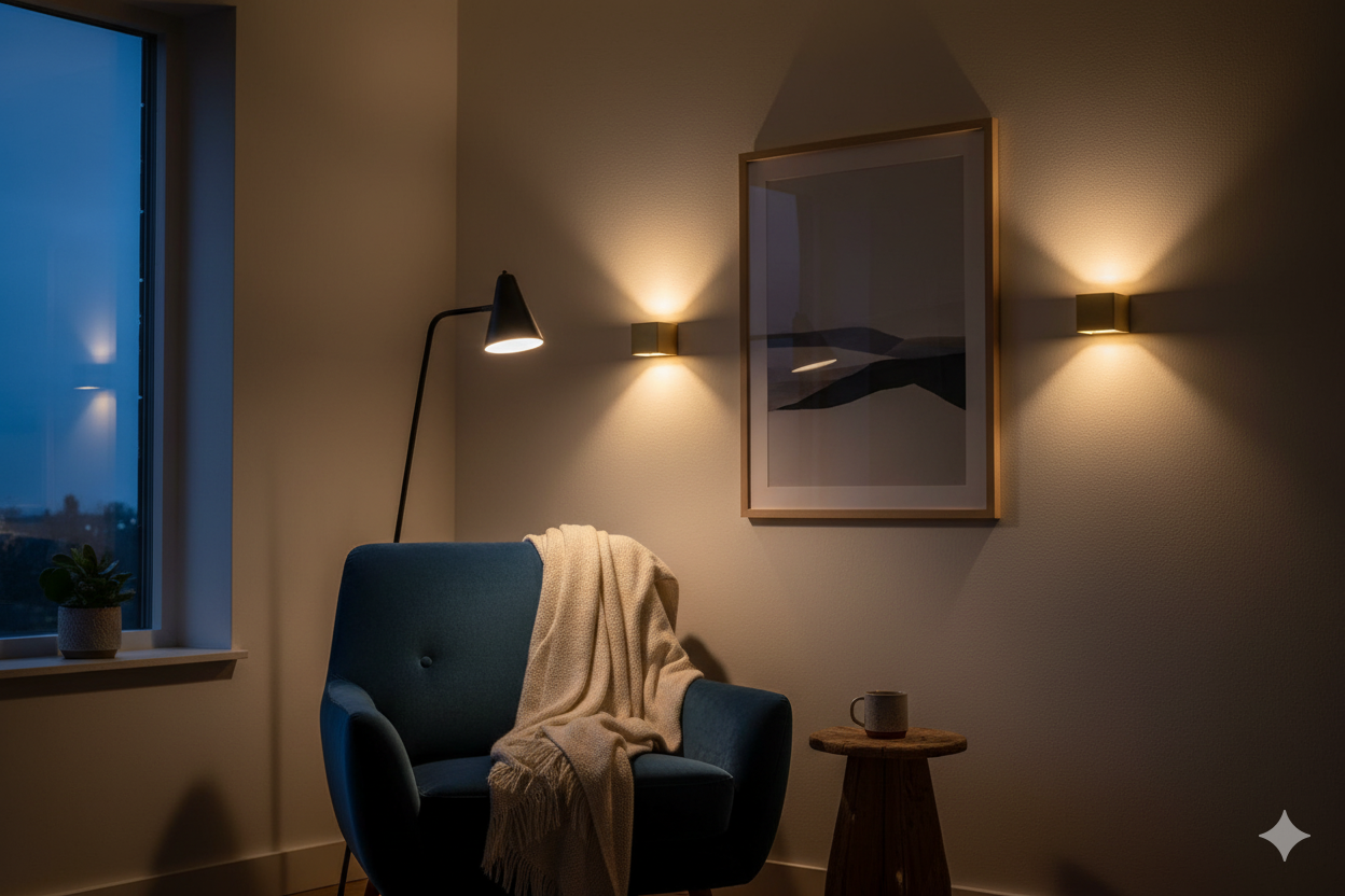
The Magic of Light & Reflection: Let There Be (Layered) Light!
The cardinal sin of small-space design is, without a doubt, bad lighting. A single, sad ceiling fixture casting harsh shadows from above is the fastest way to make a room feel “dim and closed-in”.
-
Ambient (or General) Lighting: This is the room’s overall glow, its foundational layer of light. Instead of a single, central fixture, opt for flush mounts. These fixtures sit close to the ceiling, creating the illusion of more headroom and keeping sightlines clear—a critical factor in a small room.
-
Task Lighting: This is your focused, functional light, aimed at specific activities like reading, cooking, or working from home. A well-placed task light—like a floor lamp arching over a reading chair or an under-cabinet light in the kitchen—does more than just illuminate your work. It creates a “specific, private-feeling area,” a psychological nook that feels like a room within a room.
-
Accent Lighting: This is the jewelry of your lighting scheme, used to add depth and highlight architectural features or decor. The undisputed hero of accent lighting in small spaces is the wall sconce. Sconces provide beautiful, ambient light without consuming a single inch of precious floor or table surface area.
Beyond artificial light, maximizing natural light is non-negotiable. Ditch heavy, light-absorbing drapes and embrace sheer, gauzy curtains that allow sunlight to pour in while still providing privacy.
Finally, unleash the power of mirrors. A large, well-placed mirror is the ultimate space-doubling illusionist. Position one on the wall opposite your largest window, and it will bounce light and the outdoor view all around the room, making it feel brighter, larger, and more open.
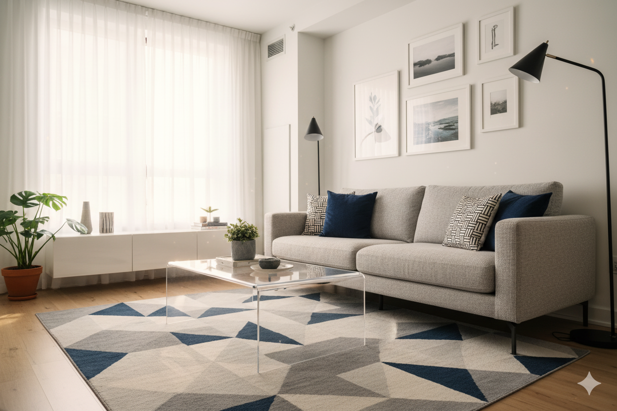
The Great Furniture Debate: Go Big (But Smart) or Go Home
Here’s one of the biggest misconceptions about decorating a small apartment: small space, small furniture. Wrong. Designers will tell you that filling a room with a clutter of tiny, disconnected pieces—a small loveseat, a tiny armchair, a smattering of little tables—actually makes it feel more chaotic and cramped.
The pro move? Go for fewer, larger anchor pieces. A single, well-proportioned sectional or a full-size sofa can make a space feel more grand, intentional, and surprisingly less cluttered.
However—and this is the crucial part—that larger piece must have a low visual weight. This isn't about how much the sofa actually weighs; it’s about how heavy it looks. Here’s how to choose furniture that feels light and airy, no matter its size:
-
Get Leggy: Always choose furniture that sits up on raised legs. Sofas, chairs, consoles, and side tables with exposed legs create negative space underneath, allowing you to see more of the floor.
-
Think Clearly: Transparent materials like glass and acrylic (often called Lucite) are your best friends. A glass coffee table or a set of acrylic dining chairs take up physical space but almost no visual space.
-
Keep a Low Profile: Opt for furniture with low-slung silhouettes—sofas with low backs, media consoles that sit closer to the ground. This keeps the sightlines across the room clear and open, preventing any single piece from dominating the space and making it feel boxed in.
Color Theory for the Cramped: Painting Your Way to a Bigger Room
Paint is the cheapest, fastest, and most transformative tool in your design arsenal. But in a small space, color isn’t just about aesthetics; it’s a tool for architectural deception. You can use it to redraw your room's perceived dimensions, blur boundaries, and direct the eye exactly where you want it to go.
The conventional wisdom holds true: light, neutral colors are a safe bet. Shades of white, cream, and pale gray are fantastic at reflecting light, which naturally makes a space feel bigger and brighter.
But playing it safe isn’t your only option. Let’s explore some more advanced, designer-approved strategies:
-
Manipulate the Ceiling: To create an instant illusion of height, paint your ceiling a shade that is just slightly lighter than your walls. This subtle shift makes the ceiling feel higher and farther away.
-
Use Dark Colors Strategically: Don’t be afraid of the dark. While a dark color on all four walls can absorb light and feel enclosing
3 -
Wield Patterns with Purpose: When it comes to patterns, be intentional. To add height, use wallpaper with vertical stripes.
Masters of Disguise: The Art of Multifunctional Furniture
In a small home, every piece of furniture needs to earn its keep. Single-use items are a luxury you can’t afford. This is the era of the multitasker, the chameleon, the master of disguise. Multifunctional furniture isn't just a trend; it's the non-negotiable foundation for a stylish, organized, and functional small space.
Before you buy a single thing, consult this guide to the most valuable players in the small-space game.
| Superhero Name (Furniture Type) | Superpower (Best For...) | Pro Tip (Selection Advice) | Find Your Hero (Where to Shop) |
| The Transformer (Murphy Bed/Wall Bed) | Maximizing floor space in studios; creating a dual-purpose office/guest room. |
Look for models with integrated sofas or desks to get a 3-in-1 solution. Lifetime warranties on mechanisms are a sign of quality. |
Apt2B |
| The Stowaway (Storage Ottoman/Bench) | Hiding living room clutter (throws, remotes, toys) while providing extra seating or a coffee table surface. |
Opt for an upholstered top for comfort, but consider a flat-topped version if it will primarily serve as a coffee table. Great for entryways. |
Target |
| The Social Butterfly (Expandable Dining Table) | Small-space dwellers who love to host. Compact for 2-4 daily, expands for 6-8 guests. | Test the extension mechanism in-store if possible. A pedestal base can make it easier to squeeze in extra chairs versus traditional legs. |
IKEA |
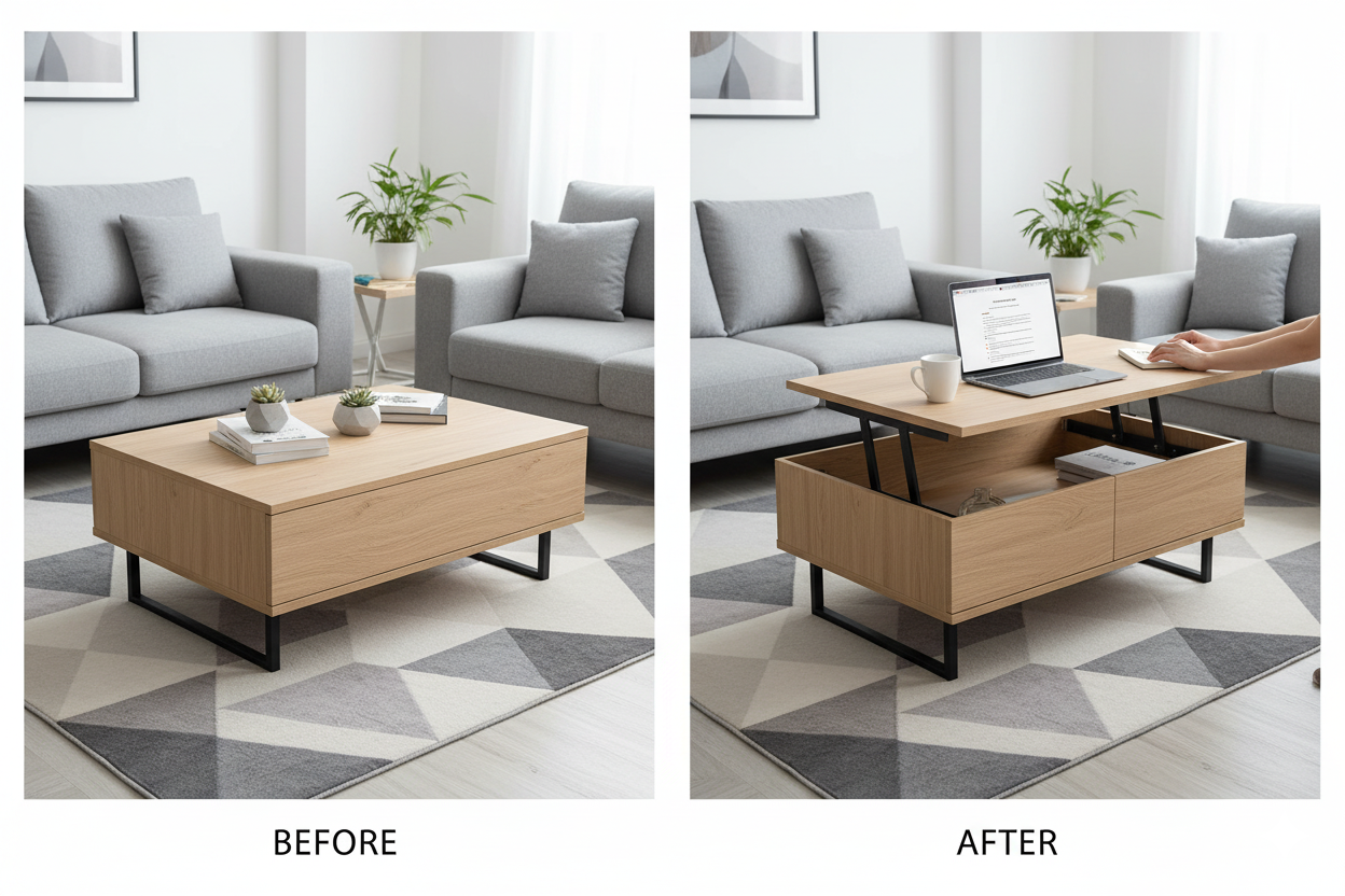
| The Workhorse (Lift-Top Coffee Table) | The WFH warrior without a dedicated office; perfect for laptop work or casual meals from the sofa. |
Ensure the lifted height is ergonomic for you. Models with extra hidden storage underneath are a double win. |
Wayfair, Apt2B |
| The Chameleon (Modular Sofa) | Oddly shaped rooms and renters who move frequently. Reconfigure from a sectional to a sofa and chair as your needs change. |
Lightweight pieces are easier to move. Measure each individual module to ensure it will fit through your doorways. |
Albany Park |
Part II: Cracking the Code: 3 Fail-Proof Layouts for the Narrow Living Room
Ah, the long, narrow living room. It’s the architectural equivalent of a doctor’s waiting room or a train carriage—a space that feels more like a passageway than a place to relax.
Layout 1: The Classic Corridor
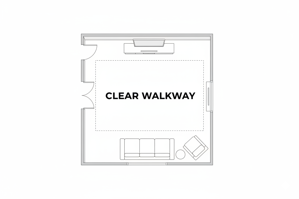
This is the most intuitive and practical solution, especially if your living room is a major thoroughfare to other parts of your home. The core principle is to make a conscious decision to dedicate one long side of the room to pure circulation, creating an unobstructed path that makes the entire space feel more organized and intentional. You’re designing for movement first, then arranging for living.
-
The Arrangement:
-
Anchor the Room: Place your main sofa against the longest uninterrupted wall. This is the gravitational center of your seating zone.
-
Face Off: On the wall directly opposite the sofa, place a slim media console or a low credenza for your television. To maximize floor space, wall-mounting the TV is the superior choice.
This creates a clear focal point for the room. -
Centerpiece: In front of the sofa, use a narrow coffee table. A rectangular or oval shape will echo the room's dimensions, but a round storage ottoman can soften the hard lines and is a safer, bump-free option for navigating the space.
-
The Walkway: The key to this layout's success is maintaining a clear, generous walkway—at least 3 feet wide—along the other long wall.
-
Accent (with Caution): If you have the width, you can add a single, small-scale accent chair angled toward the sofa. However, it must not encroach on your designated walkway. If it does, skip it.
-
By formalizing a dedicated walkway, you eliminate the frustrating daily dance of weaving around furniture. This makes the "living zone" on the other side feel protected, cozy, and deliberate, rather than like a collection of obstacles in a hallway.
Layout 2: The Conversational L-Shape
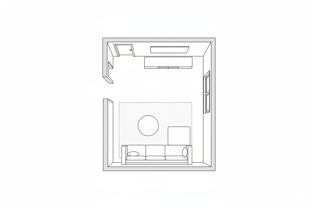
If your primary goal is to make your narrow room feel wider and more sociable, this layout is your champion. Its entire purpose is to fight the "train carriage" effect by introducing a strong perpendicular line that visually slams the brakes on that bowling-alley momentum.
-
The Arrangement:
-
Form the "L": The hero of this layout is an L-shaped sectional sofa. As counterintuitive as it sounds, a generous sectional can be the best choice for a narrow space.
Place the long side of the sectional against one of the long walls. The shorter side (the chaise) will then extend into the room, creating that crucial perpendicular line. This acts as a visual speed bump, breaking up the length of the room. -
DIY "L": No sectional? No problem. You can create the same effect by placing a standard two- or three-seater sofa against the long wall and then arranging a loveseat or two armchairs at a 90-degree angle to it.
-
Anchor the Zone: Place the entire L-shaped grouping on a large area rug. This is non-negotiable. The rug visually corrals all the pieces into one cohesive zone, reinforcing the feeling of a distinct, contained area.
-
Go Round: A round coffee table is the perfect centerpiece here. It’s easier to navigate from all seats and its curved shape provides a beautiful contrast to the room's rigid, rectangular lines.
-
The Opposite Wall: The wall opposite the long side of your sofa is now free for a slim sideboard for storage, a gallery wall of art, or your media unit.
-
Layout 3: The Divided Duo
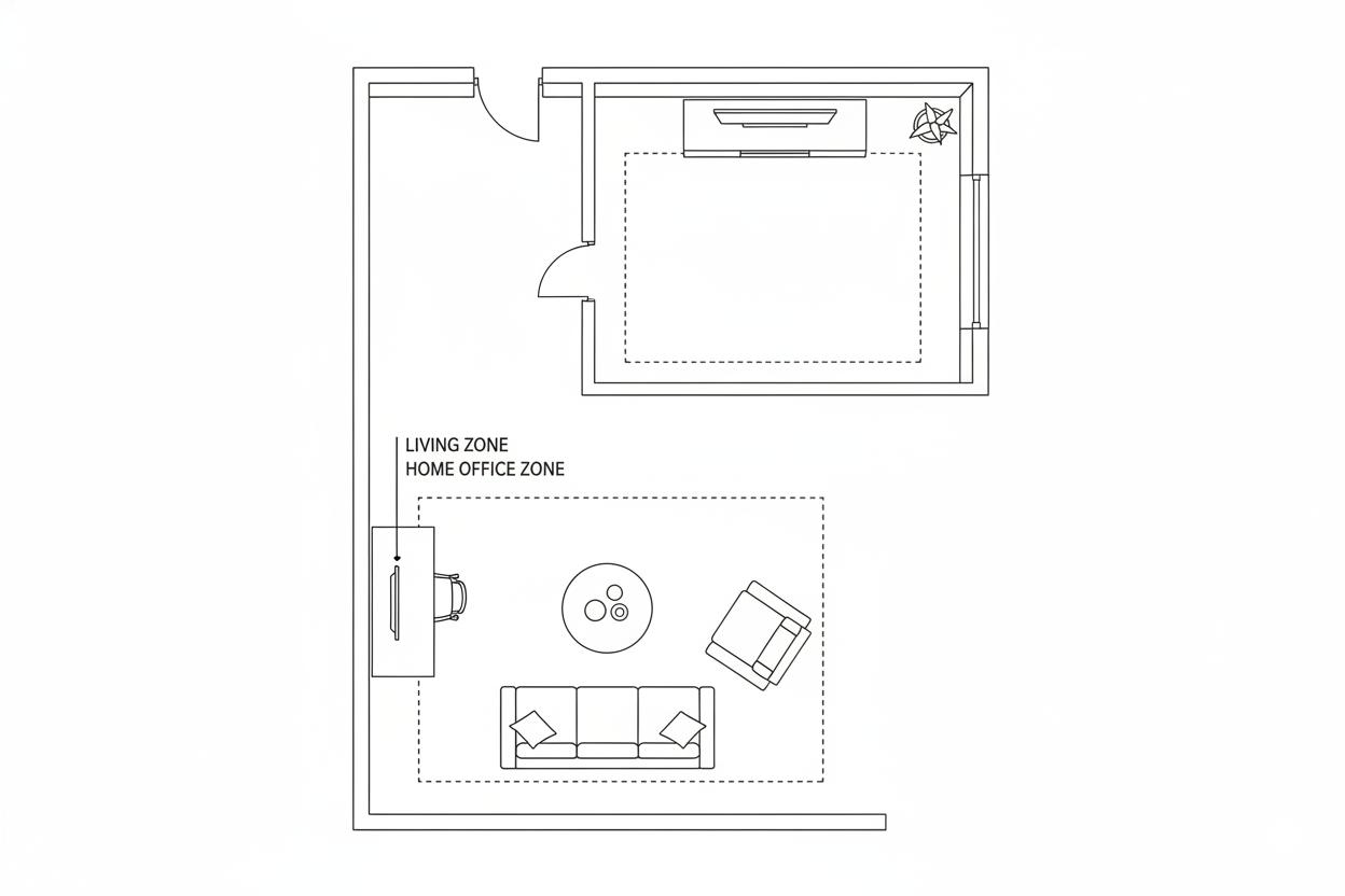
This is the most advanced and transformative layout, perfect for those who need their long room to work twice as hard. The strategy is to treat the single elongated space as two smaller, distinct "rooms" or zones.
-
The Arrangement:
-
Create a "Wall": The key move is to "float" your main sofa in the middle of the room, perpendicular to the long walls, with its back facing what will become your secondary zone.
6 -
Solidify the Division: Place a slim console table or a narrow desk directly against the back of the floating sofa. This is a classic designer move that makes the arrangement feel polished and intentional. It provides a surface for lamps or decor in the main seating area and can function as a workspace or drop-zone for the secondary area.
20 -
Define with Rugs: Use two separate but complementary area rugs to clearly define each zone. This is crucial for establishing the "two rooms" illusion. The rugs should have a common color or style to feel connected, but be distinct enough to signal a transition.
6 -
Zone 1 (The Main Event): In the primary zone (likely oriented toward a fireplace or TV), arrange your floating sofa and perhaps an accent chair to form a self-contained conversational area.
-
Zone 2 (The Bonus Space): In the secondary zone behind the sofa, create your second "room." This could be a home office with a desk and chair, a cozy reading nook with two armchairs and a task lamp, a music corner with a record player, or a dedicated play area for kids.
-
Stop the Eye: To further combat the room's length, place a tall piece of furniture, like an open-shelved bookcase or an armoire, against the short wall at the far end of the room. This acts as a visual endpoint, making the room's proportions feel more balanced.
-
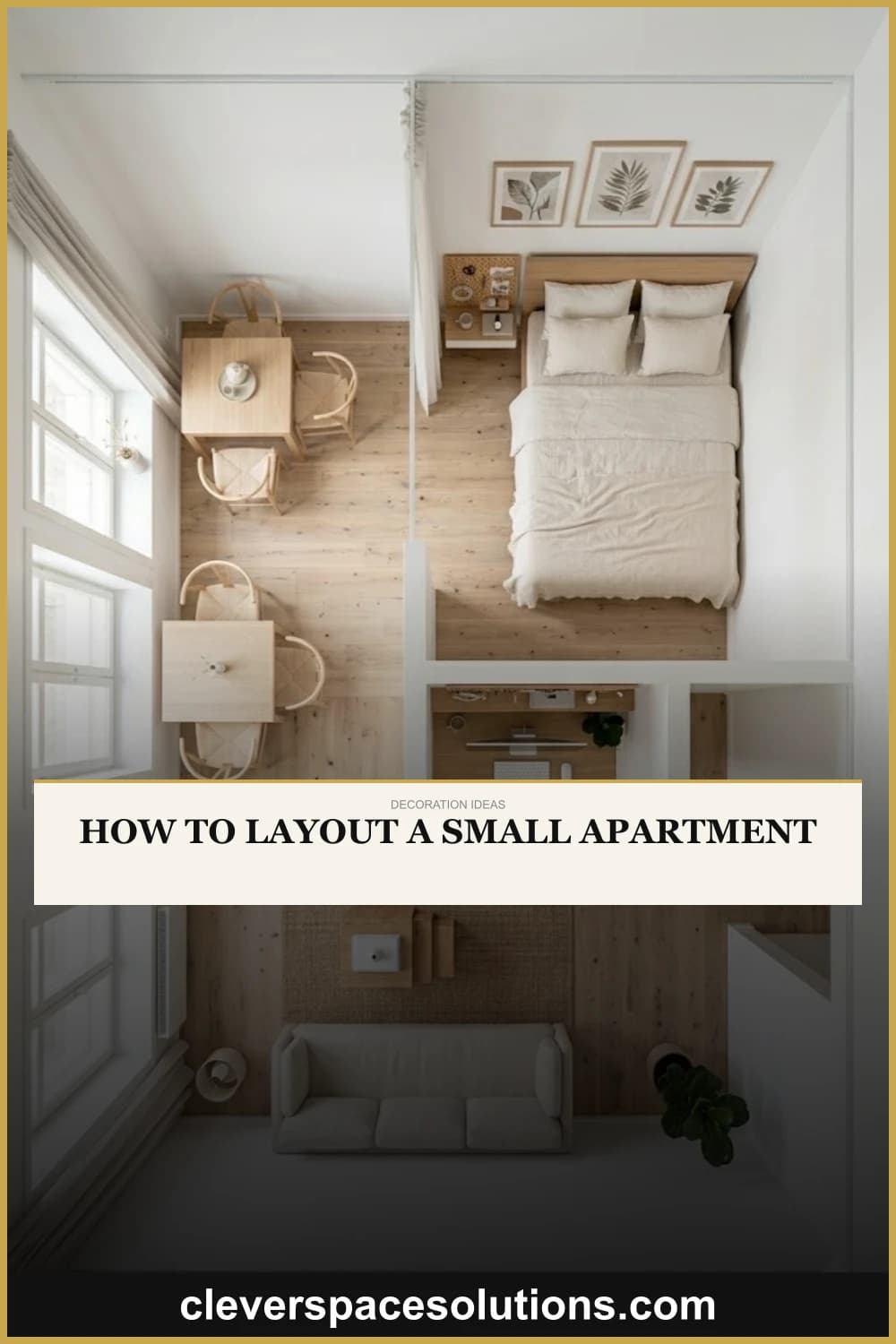
Part III: The Studio Apartment Solution: 5 Real-Life Layouts to Steal
Living in a studio is the ultimate exercise in spatial efficiency. It’s one room tasked with being your bedroom, living room, kitchen, dining room, and office. The secret to success isn't about cramming everything in; it's about creating distinct, functional zones that make your single room live like a full apartment. Here are five real-life-inspired, plug-and-play layouts you can steal today.
Case Study 1: The Savvy Separator
-
The Concept: This layout is for those who crave the privacy and definition of a separate bedroom but are working with a single open space. It uses a physical (but non-permanent) divider to cleverly carve out a sleeping nook, creating the powerful illusion of a true one-bedroom apartment without sacrificing light or airiness.
-
The Hero Piece: A tall, open-shelved bookcase. The IKEA KALLAX is the undisputed, budget-friendly champion of this strategy for a reason.
-
The Execution: Place the bookcase perpendicular to a wall, extending out into the room to create a semi-private alcove for your bed. The magic of an open-shelved unit is that it provides a clear visual division while still allowing natural light and air to flow through, preventing the "bedroom" from feeling like a dark, stuffy box.
For a softer touch, you could swap the bookcase for a macramé curtain, a screen of timber slats, or even a ceiling-mounted curtain track. This layout is inspired by countless real-life renters who have brilliantly solved their storage and privacy struggles with a little IKEA ingenuity.
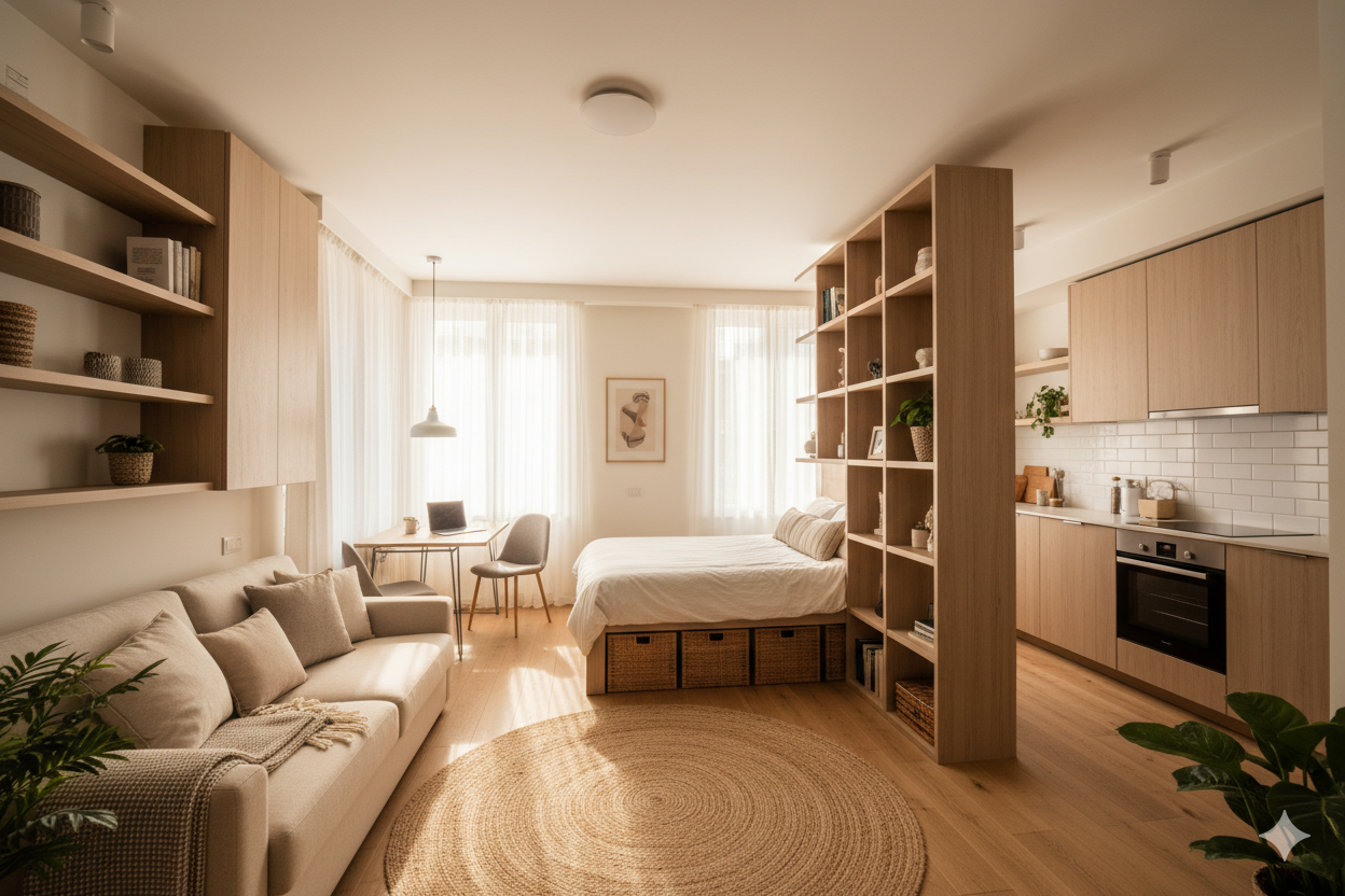
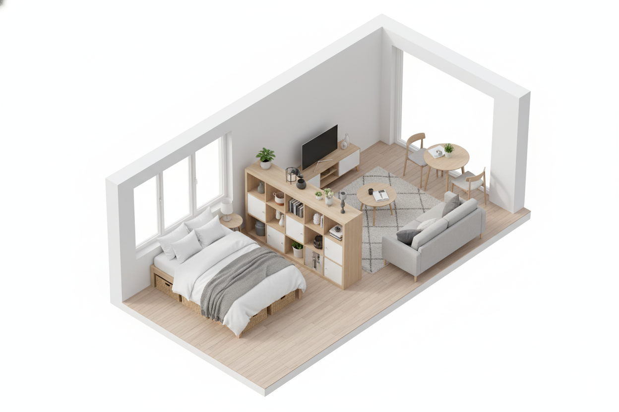
Case Study 2: The Urban Illusionist
-
The Concept: For the design purist who loves a wide-open, airy feel, this layout forgoes physical dividers entirely. Instead, it uses the sophisticated art of furniture placement and visual cues to create "floating zones." It’s a masterclass in suggestion, maintaining a completely open floor plan while still clearly delineating function.
-
The Hero Piece: The sofa, repurposed as a subtle, powerful room divider.
-
The Execution: Start by tucking your bed into one of the back corners of the room. Next, "float" your sofa in the middle of the space, positioning it with its back facing the bed. This single move creates a strong, clean line that separates the public "living" space from the private "sleeping" space.
To make this feel even more intentional, place a slim console table or a narrow desk against the back of the sofa. This creates a perfect spot for a lamp, a charging station, or even a compact workspace. The final, critical element is the use of area rugs. Place one large rug to anchor the living room arrangement (sofa, coffee table, accent chair) and a smaller, cozier rug (like a sheepskin or runner) beside the bed. These rugs act as "islands," visually grounding each zone and making the separation feel deliberate. The key is to maintain clear, intuitive pathways around these zones for easy movement.
Case Study 3: The Transformer
-
The Concept: This is the ultimate layout for the space-maximization purist. It’s designed for the person who wants their studio to be a full, spacious living room by day and a comfortable, dedicated bedroom by night—with zero overlap and zero compromise. It demands a daily ritual but offers the greatest reward in terms of flexible floor space.
-
The Hero Piece: A high-quality, modern Murphy bed or a genuinely comfortable, stylish sleeper sofa.
-
The Execution: This layout is built entirely around its transforming centerpiece. With a Murphy bed, the entire footprint of your bed vanishes into the wall during the day, freeing up an enormous amount of floor space for a proper living room setup, a generous home office, a dining area for six, or even a home yoga studio.
Today’s Murphy beds are a far cry from their clunky ancestors; many feature integrated sofas that are revealed when the bed is up, or pull-down desks, giving you a 3-in-1 solution. If a Murphy bed isn’t feasible, a top-tier sleeper sofa can achieve a similar goal. The living area becomes the primary focus, with a lightweight coffee table that can be easily pushed aside at night. This layout is a testament to the power of investing in one brilliant, hardworking piece of furniture.
Case Study 4: The Lofted Dream

-
The Concept: If your studio is blessed with the one feature you can’t fake—high ceilings—then this layout is your ticket to literally doubling your living space. By thinking vertically, you can create a two-story home within a single room.
-
The Hero Piece: A sturdy, well-designed loft bed.
-
The Execution: This is the most construction-intensive option, but it offers the most dramatic payoff. An elevated sleeping platform creates a private, cozy bedroom area "upstairs," completely removed from the main living area.
The real magic happens below. The space underneath the loft is now a full-fledged, human-height room. This can become your living room, furnished with a sofa and media center; a dedicated home office; or the walk-in closet of your dreams. This layout is the ultimate embodiment of the "go high" principle, transforming vertical space into tangible, usable square footage.
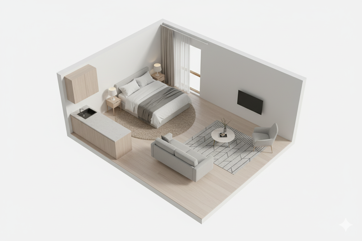
Case Study 5: The Minimalist Pod
-
The Concept: Instead of trying to carve a small space into even smaller "rooms," this layout embraces its compact nature. It focuses on creating a single, serene, hyper-organized, and harmonious environment—a "pod" for living. The philosophy is less about separation and more about seamless integration.
-
The Hero Piece: Not one piece, but a disciplined commitment to hidden storage and double-duty design.
-
The Execution: This layout is a masterclass in the "less is more" philosophy.
The real workhorse is storage, but it’s all hidden from view. Think under-bed storage drawers on casters, sleek, handle-less cabinets that blend seamlessly with the walls, and clever use of vertical space with corner shelving. The color palette is strictly controlled and light, often monochromatic, to enhance the feeling of calm and space.
Conclusion: Your Small Space Is Your Superpower
Living in a small apartment isn't a limitation; it's a filter. It forces you to be creative, to be intentional, and to be a ruthless editor of your own life. It demands that you choose quality over quantity, function over frivolity, and personal style over passing trends. The constraints of a few hundred square feet are not a bug—they're a feature. They push you to design a home that is a true reflection of how you live, what you value, and who you are.
You now have the principles, the blueprints, and the real-world inspiration to transform your compact space into a functional, beautiful, and deeply personal home. Take these ideas, tear them apart, mix and match them, and start experimenting. Move that sofa. Buy that rug. Hang that mirror. The most important rule of all is that the best layout is the one that works for your life. Your small space isn't a problem to be solved; it's a story waiting to be told. Go tell it.
More from Studio & Small Apartment
Layout, decor, and life in studio and small apartments.
How Do You Decorate a Studio Apartment?
Wondering how to furnish your studio apartment without it feeling cramped? This guide answers your questions with smart ideas for zoning, furniture, and deco...

How to Decorate a Studio Apartment: An Expert's Guide
8 min read
How Do You Decorate a Studio Apartment?
10 min read

The Art of Studio Living: Your Complete Guide
10 min read
3 Flawless Layouts and 5 Real-Life Studio Solutions
21 min read
How Do You Decorate a One-Bedroom Apartment?
18 min read
How to Light an Apartment with No Overhead Lighting (Room-by-Room Guide)
23 min read
Tags

Written by Joesp H.
Interior Design & Small Space Living Specialist
Former marketing manager turned full-time home optimizer. After living in 7 homes ranging from 450 to 2,000 sq ft, I started CleverSpaceSolutions to help people create organized, functional spaces on real budgets.
Other Articles

3 Flawless Layouts and 5 Real-Life Studio Solutions
Wondering how to arrange furniture in your small apartment? Get 3 fail-proof layouts for narrow living rooms and 5 genius plans for studio apartments.
Color Drenching Small Spaces: 2026's Boldest Paint Trend
Color drenching paints walls, ceiling, and trim all one color. Searches are up 325% on Houzz in 2025. Here is how to pull it off in a small space.
How to Create a Cozy Reading Nook in a Small Apartment (No Spare Room Required)
Create a cozy reading nook in a small apartment with no spare room needed. A chair, a lamp, one shelf — and reading just 6 minutes cuts stress by 68%. Here's how.